top of page
Artist Evaluations
This page includes evaluation, remakes and works inspired on the artists that are investigated and researched.
Mike McQuade
McQuade is a graphic designer based in New York, whose work has been mainly for the advertising side and is mostly recognised and known for his scrapbook and collage style of creating his works.
The following is an analysed version of one of his works.

Source: WIRED UK - Would you trust this man with your money?
Credits: Mike McQuade
Concept:
The image portrays Mark Zuckerberg in the centre, facing towards an audience, it seems, as if he is speaking to defend or prove a point regarding a serious or legal case, while snippets of currency-related pictures, and a map. This was all compiled by McQuade to tackle the topic of Facebook's attempt at making a new cryptocurrency called "Libra", meant to challenge those like Bitcoin, but was immediately attacked due to Facebook's horrible past failings in civil rights with its policies, dishonesty and practices.
McQuade probably chose these images to use for this particular piece because of the impact that they are able to create together. The overall mood of this can be outrage or controversial, depending on the viewer. Outraged, shown from the background colour being a strong red colour to Zuckerberg having to defend another platform he has made. Controversial, that it can either be beneficial to the community and its people or damaging given Facebook's not-so-clean past
Process:
This piece was made from a photo of Mark Zuckerberg that might have either been at the US congress talk or another court hearing. This is also accompanied by pictures representing or that are symbolic of the economy of cryptocurrency.
McQuade most possibly had the first step to find a clear headshot of Zuckerberg, only cutting out the shoulders. Placing the cutout onto a solid coloured background, a texture can be added onto the background to give a subtle effect. Next, after collecting several pictures to represent the issue at hand, snippets of it can be taken in a good way, but also keeping Zuckerberg as the main focus of the entire piece.
Breaking down the elements used in the piece:
Mark Zuckerberg: This photo was most possibly taken when he was called in front of US Congress to discuss about Libra and what it really is alongside how trustworthy it really is.
Global map: This was added to show that the entire world can access Libra and use it, but also shows that everyone is at risk as it will challenge countries’ monetary policy
Different currencies: refers to how one obtains crypto currency, by trading in a certain amount of established currency such as USD or GBP
Stock market: can be referring to the crypto stock market crash in 2018, emphasizing the potential that Libra could cause it to crash further
We were then tasked to recreate one of his pieces as well as attempt to create a piece or with inspiration from his works.

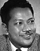
These were the secondary resources used to create each experiment within his style, based off our own topics in relation to society. First and foremost, pictures of the subject, P.Ramlee. I have decided to include S.Shamsuddin and Aziz Satar as they both star in Ramlee's most famous work, the Bujang Lapok Series.


The rest of the resources are pictures of Ramlee's most famous works, the logo and title of the company he used to produce under, and a newspaper page regarding his shocking death.


The Rough Recreations

This is the recreation of Mike McQuade's Tiger Woods, Kobe and Lebron James magazine cover (shown below). This was done to have a rough idea and understanding of the process on how to create a piece similar to Mike Mcquade's. Evidently, this style of collage is not suitable for the figures of people selected, since their photos are quite old, and the difference in popularity.
However, the recreation did come out decent.


This is the second recreation done with reference to McQuade's pieces. This one was based off the Obama piece, possibly regarding the current state of America's government at the time.
I think that this style of collage works well, in portraying old Malaysia, the star P.Ramlee, and entertainment during those times.

Final Pieces


These are my final pieces out of this artist's evaluation. Both simple, clear, clean and consice.

However, I have concluded that this is my strongest piece.
The reason why this is my strongest piece is that this shows who P.Ramlee is as a whole. The works he has created which will be remembered for generations to come, inspiring those who watch them. As it features three of his most famous productions across the piece, with one of his most recognisable portraits behind it with the Malay Film Productions Ltd. writing and logo as an overlay of the photo, showing where he had worked and produced during his time. All and all, this piece.
Alex Williamson
Alex Williamson is a commercial illustrator, academic and graphic designer. He mainly creates original art pieces by collages of many different images taken with his photography skills, illustrations made by hand and superimposing them digitally.
The following is an analysis of one of his works.

This is his LGBT Rights work, more specifically, his Trans Rights piece. Williamson has used mixed media to produce this work including photography, mark making and digital editing. Using different types of techniques for this work is very well chosen to represent the intensity and gravity of the overall situation, especially on this subtopic. There is a sense of great importance within the piece, with terms of the abstract and proportion of the cutouts and graphics used, including the mark-making and boldness of certain aspects.
Using images such as news articles, pictures of possible protesters during trans rights protests, symbols relevant to the subject, the word itself clear as day, to an image of a red cross over someone yelling and images of how chromosomes form, DNA strands and chemical compositions of certain chemicals. All of these graphics are related to the topic, therefore are well chosen.
There is a sense of constraint and combat in this work. In a sense that people have been fighting for transgender rights for so long, despite transgender rights is basically basic human rights despite the different genders.
The background colour acts as a nice contrast to the colourful composition, the amount of negative space not causing the composition to overwhelm the canvas, nor make it too small to project its message. Using red and blue, especially since they are complementary colours of each other, helps bring out the subjects used in the portrait without drowning out the other. The use of the vibrant red invokes feelings of danger since trans people are part of some people’s targets including the rest of the LGBT community, no matter the religion of belief. Red indicates fear, chaos, aggression and blood in this context. All of which links to transgender lives and their battle that has not stopped. The blue included in the portrait conveys peace, one that can be found within the community itself, supporting each other through obstacles that they face in their lifetime. However, since the blue is a shade duller than the usual vibrant like red, it gives a different meaning to it. Conveying sadness, depression, confusion and loneliness that some, if not all, trans individuals will experience or have throughout their lives depending on their situations. The black in this context does not contribute much to the feelings that this piece displays, but mostly used to outline or to emphasize some aspects more clearly, but still not overwhelming the piece as a whole.
The silhouette is a woman, possibly hinting to the article that this piece was originally intended for feminism. Reason being for this to be the focal point is that every other aspect of the piece is within the silhouette, causing the viewer to notice the general shape of the composition first. The use of the complementary colours of red and blue, despite their vibrance, draws the eye to the piece as a whole, starting from the more general aspects such as the background coloured gender symbols and black outlined parts all over, before going over the more intricate and less obvious details. All in all, this piece does very well in having the viewer’s view moved all across the canvas, inspecting and taking in every bit and the message that they present.
The piece seems to be constructed from harsh and clean forms. Cut up pieces of powerful images such as the protesters and rough mark makings discreetly over the silhouette, to a simple block of a biology page or symbols. The reasoning behind the harsh and clean forms used in this portrait may be to show that there is calmness in chaos and chaos in peace.
After studying Williamson’s works, this has encouraged me to focus on implementing and learn about mark-making and the overall composition of a piece, to make the message clear and concise, as well as bringing more meaning to new artworks as a whole. The main influence of this work is the use of colour and proportion and minimalistic amount of colour used to portray it. I have been inspired to use more textures and fewer colours in my own projects to come, hoping to improve on what I have learnt from evaluating this particular piece.
Inspired Work

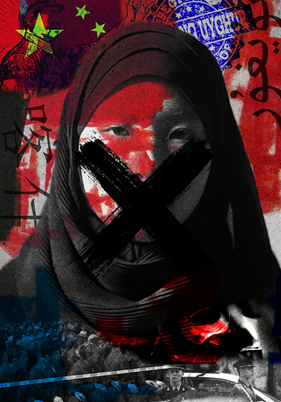
This is the final outcome of this artist evaluation. The experiments were basically the final piece, but with one to two alters as i progressed, that's why they are not included here. This final piece was made, inspired by Alex Williamson's style, is meant to showcase and highlight the commotion and inhumane treatment towards the Uyghur Muslims in China. This is explicitly told at the bottom half of the piece, with images depicting the said Muslims in a concentration camp, police and law enforcement meant to keep people in line and obey, and a mask of a protester, fighting for the release of the Uyghur Muslims. The reason why this was chosen was because media rarely shines light on topics like these, given the fact that the Mulan movie had been filmed in the Uyghur region and absolutely zero attention had been brought to the unfortunate people's situation, one which they have no control over.
bottom of page
